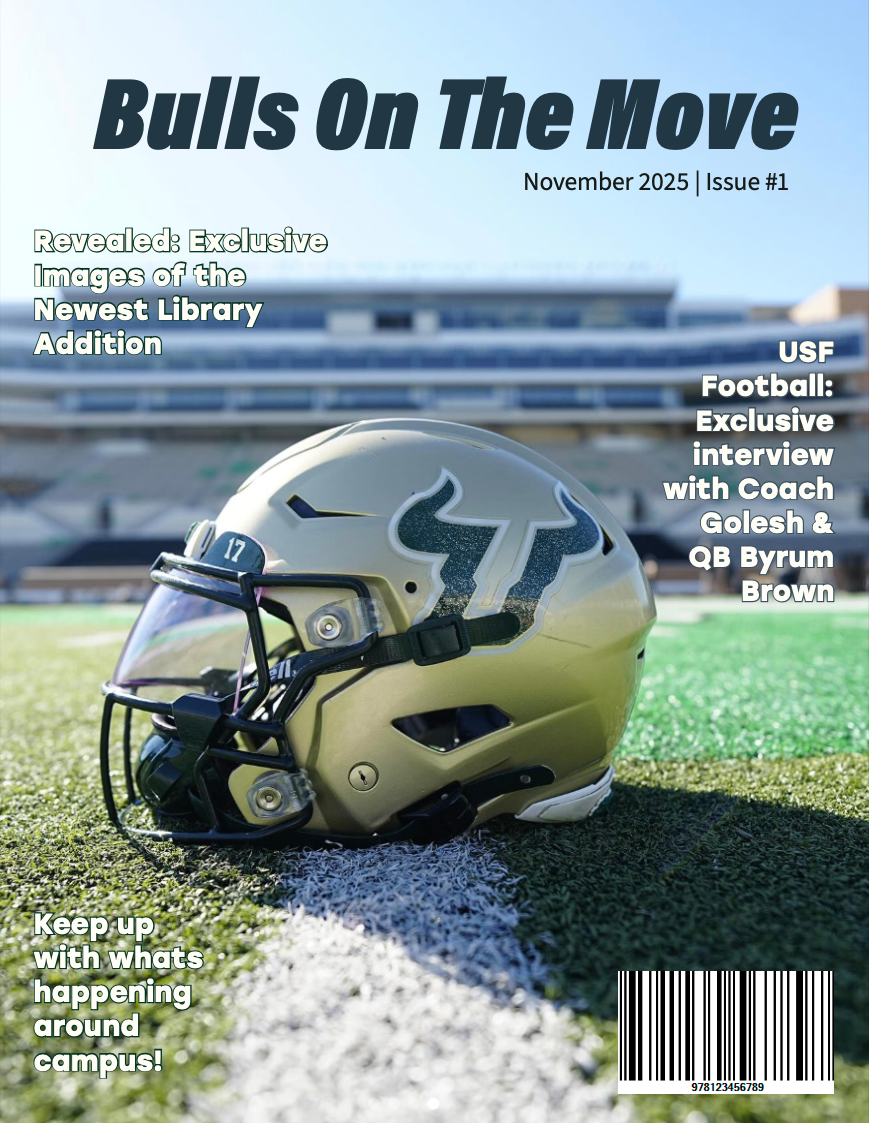
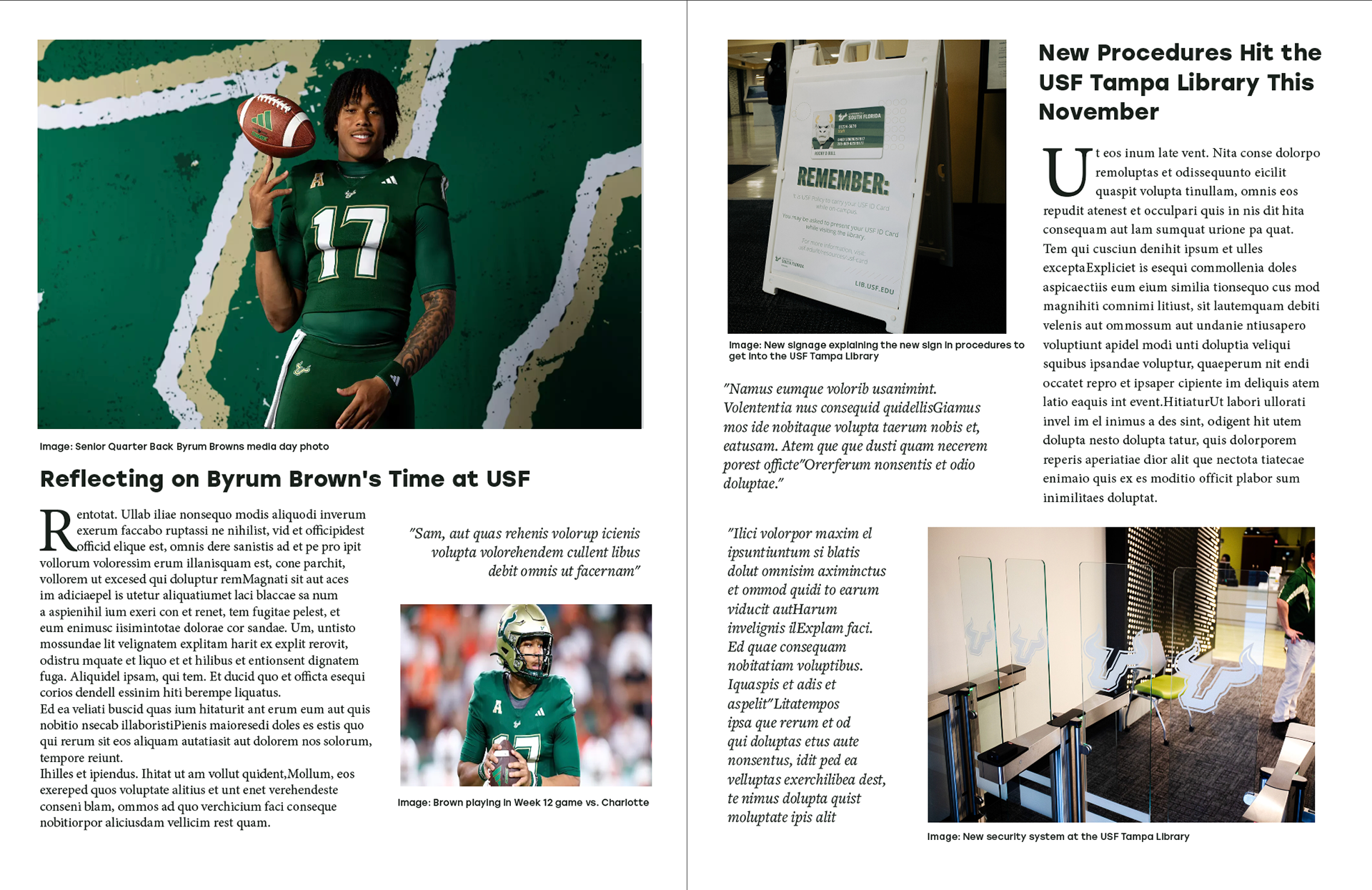
Purpose: This project focused on creating a magazine concept about campus life. My goal was to design a cover and two-page spread that felt clean, eye-catching, and easy for students to read, while choosing stories that could work both visually and as features for student or local media.
My Role: Designer, content creator, and story planner.
Tools Used: Adobe Illustrator and Google for photo sourcing
Process: I started by choosing stories that I thought students would care about and that could also make strong features, like updates on campus spaces and student athletics. From there, I explored different visual directions for the magazine and matched the look and feel to the tone of the stories.
For the cover, I used a bold modern typeface and a simple color palette to keep the focus on the image. For the inside spread, I used columns, spacing, and a mix of images and text to guide the reader through the content. After getting peer feedback, I made refinements like adjusting font sizes, changing the body text style, and adding captions to make the spread clearer and more readable.
Final Deliverables: A finished magazine cover and two-page spread with balanced typography, consistent colors, and a layout designed to be both engaging and easy to follow. The stories and layout work well for creative content and could also support PR goals like pitching campus stories.
What I Learned: This project helped me understand how design choices affect readability and how visuals and content work together to tell a story. I also learned how to think about audience interest and news angles while still keeping the design clean and creative.